RegresarGo Back /
Barreiro
SectorIndustry
Hardware Industry
Descripción del clienteClient Description
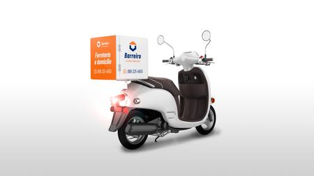
Barreiro is a newly established hardware store. Founded by the family whose last name gives the business its name, Barreiro aims to offer professional service in the sale of various items for construction, DIY projects, and household needs, with the added value of home delivery.
The Challenge with the Brand
The business lacked a branding strategy aligned with its commercial goals, as well as a solid and memorable identity. The process began by understanding the target audience, their motivations for choosing Barreiro over other hardware stores in the area, and the unique benefits and values that set it apart.
Our Solution and the Result
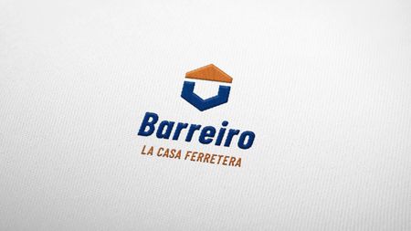
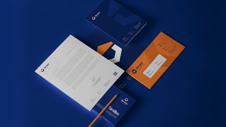
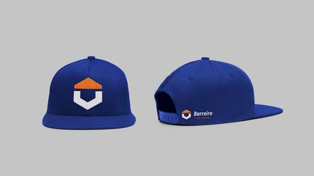
Drawing from these differentiators, we analyzed the origin of the word “ferretería,” which etymologically translates to “house of iron.” Key items commonly associated with hardware stores, such as nuts and bolts, were highlighted. Additionally, the concept of home delivery and direction was emphasized, graphically represented by an arrow. The result is a corporate identity that reflects Barreiro’s values - strength, reliability, and service. The logo integrates a bold and industrial aesthetic with a nut symbolizing the hardware industry, and a dynamic arrow that conveys efficiency and home delivery, making Barreiro a memorable and competitive choice in the hardware market.
